2
Art Institute of Chicago and Dr. Asa Simon Mittman
In this chapter
Editor’s Note: This chapter discusses what are known as formal or visual elements. These are the things that can be recognized by the eye, regardless of historical context or knowledge of the artwork’s content (what it’s about—its story).
One of the first things we can identify about any artwork is whether it is representational (depicting recognizable objects or scenes) or non-representational (not depicting recognizable objects; this type of work is also known as pure abstraction). “Abstraction” is a word that describes the depiction of forms as more like flattened shapes than how they appear in the seen world. Artistic renderings of objects exist on a continuum between abstract and naturalistic. An artwork that shows a lot of naturalism is more faithful to optical reality—what the eye sees—than one that is more abstract. Both artworks in two dimensions, like drawings and paintings, and three dimensions, like relief or free-standing sculpture, can be more or less abstract or naturalistic.
Sometimes, an artist will depict an object or a figure in a way that heightens its perceived perfection, bringing it in line with current beauty standards. This is known as an idealized representation. When an artwork is stylized, it means that the artist has depicted the object or person in a way that conforms to particular conventions, or systems of representation, rather than strict observation of the natural world.
This chapter and the following one, on composition, or the organization of elements within a work of art, will give you a toolbox of vocabulary to better understand and describe what you’re seeing as we look at artworks this term.
Line
Line is the most basic visual element. Lines can be used to define shapes and figures, but also to indicate motion, emotion, and other elements.
Contour lines and hatching
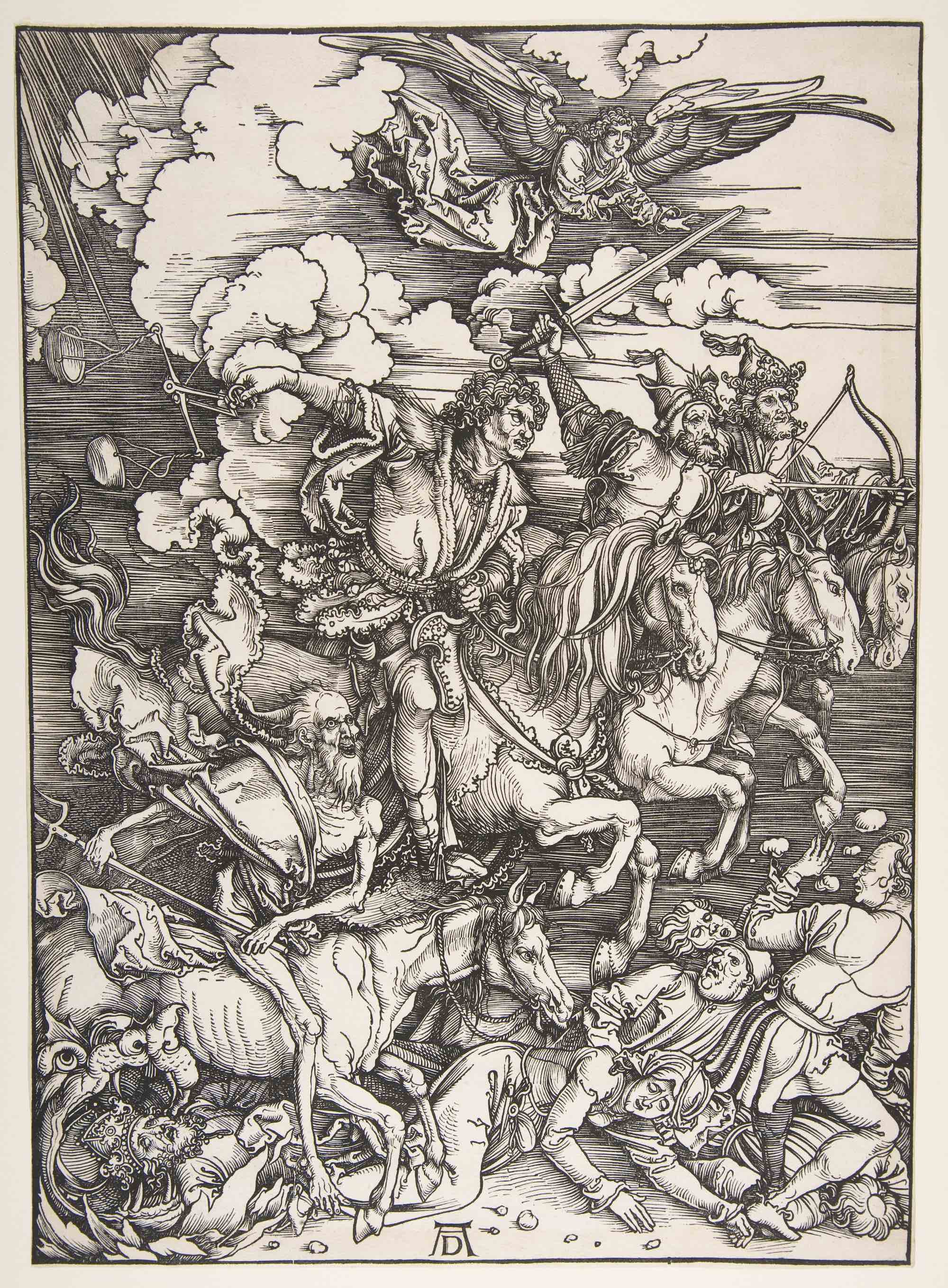
In a woodblock print of the Four Horsemen of the Apocalypse by Albrecht Dürer, contour lines — lines that define shapes — are used to mark the outside of all of the elements of the image.
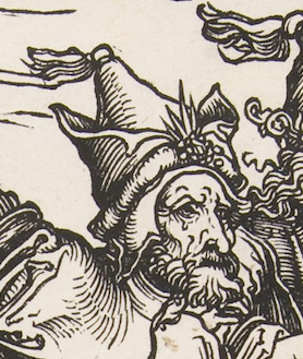
The outline of the hat on one of the horsemen, for example, is clearly made by a few black contour lines. This simple device is so effective that it is hard to remember that there is no hat here, only a few black marks on a white page.
Note, though, that lines are also used to show shading – the shadows caused when light hits one side of an object, leaving the other in shadow. On the hat, for example, the closely spaced lines, called hatching, show that the left side of his hat is in a shadow. This also helps the hat to look more three-dimensional, giving it a sense of form.
Contour lines outline all the figures and forms in the image, creating the illusion of shading and form. In addition, there are horizontal lines in the background. While these create shading, they also help create the sense that the riders are moving rapidly from left to right. Motion lines may be familiar to you from comic strips, but they appear in all sorts of work.
Organic and inorganic (geometric) lines
In the Dürer print, we can also divide the lines into organic and inorganic (or geometric) lines (see the section on shape for more on organic and inorganic). Organic lines are loose, curving lines like those found in nature. In the Dürer print, the lines of the horses’ manes and tails, the figures’ hair, and the ruffled clouds are all organic. Inorganic lines are generally straight or perfectly curving lines, like those found in geometry. In this image, most of the lines are organic, but the horizontal lines in the background are inorganic.
Implied lines
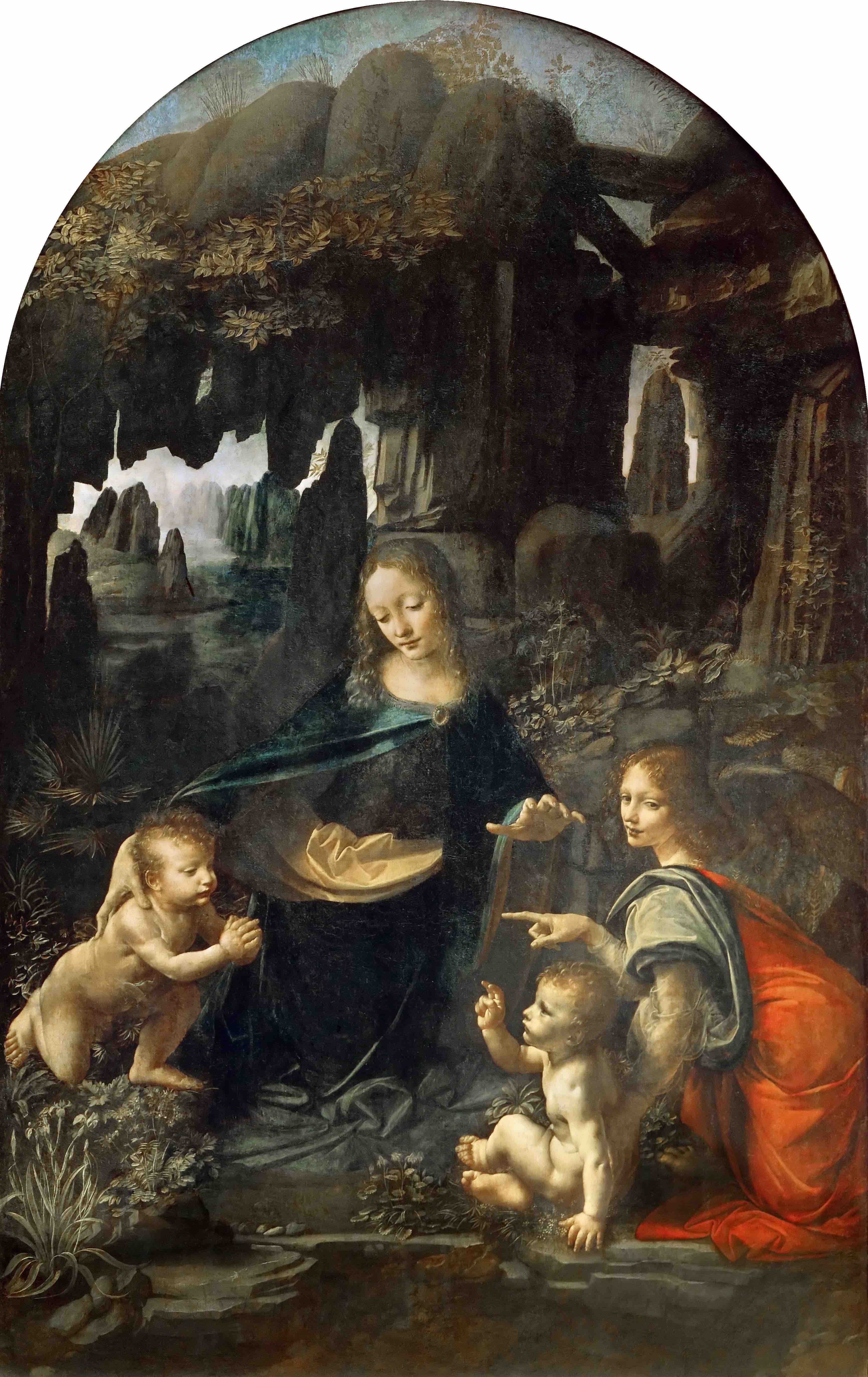
We can also look for implied lines. These are not actually drawn, but we can connect the dots (literally or figuratively) to create the lines in our minds. Leonardo da Vinci’s Virgin of the Rocks contains wonderful examples of implied lines.
Here, the implied lines are sight lines, which guide us throughout the image. These help us know where to look, and show us what is important in the painting. Follow the gazes of the figures as they look and point at one another. The angel in the red cape to the right looks out at us, and then points at the infant John the Baptist, at the left. He looks at the infant Jesus, who in turn looks back again at him. Above, Mary looks down at Jesus, and also gestures toward him with her hand.
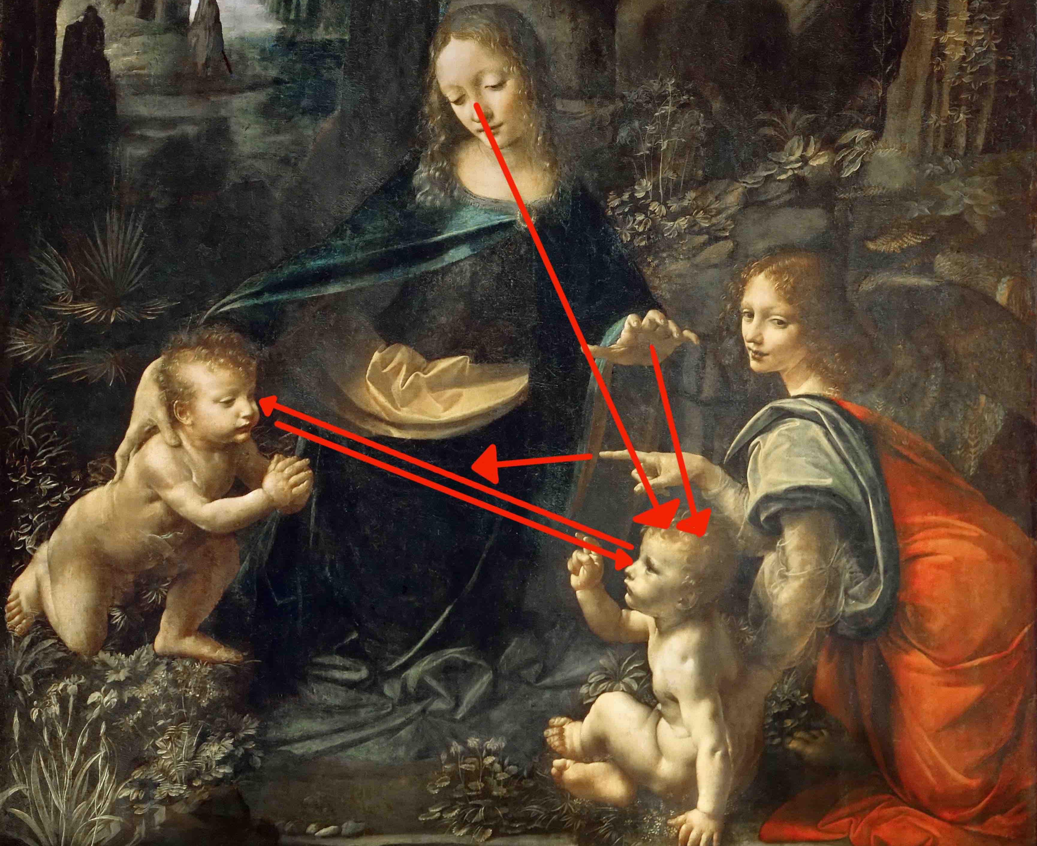
Basically, once we make it into the space of the painting by meeting the gaze of the angel, we become locked in a cycle of movement between the holy figures, guided by their sight lines.
Shape and Form
Shape builds on line and color, as it has to be made of one or both of these. Shape is the property of a two-dimensional form, usually defined by a line around it or by a change in color.
There are two main types of shapes, geometric and organic. While most works of art contain both geometric and organic shapes, looking at those that are more completely divided can serve to clarify these qualities.
Geometric shapes
Piet Mondrian is an excellent example of an artist who used geometric shapes almost exclusively. In his Composition with Yellow, Blue and Red (1937-42), Mondrian, uses straight vertical and horizontal black lines to divide his canvas into rectangles of primary colors.
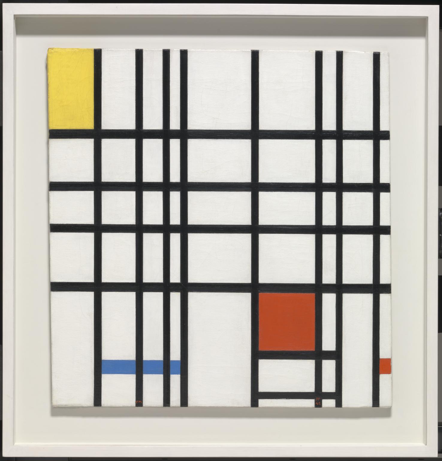
Nothing here gives the impression of the natural world. On the other hand, Maori facial tattooing, known as moko, uses primarily organic shapes. They are still, like Mondrian’s shapes, generally abstract — they do not depict any clear images — but the shapes are like those found in nature, curving, twisting, and spiraling across their wearers’ faces. The edges of the lines and shapes are crisp, but the forms are curving and sensuous.


Editor’s Note: Shape can be either positive or negative. In this photograph from the Cueva de las Manos, we can see both positive shapes (handprints created by dipping the hand in pigment and then placing it on the stone) and negative shapes (formed by applying pigment over the hand, with the resulting shape defined by the absence of pigment).

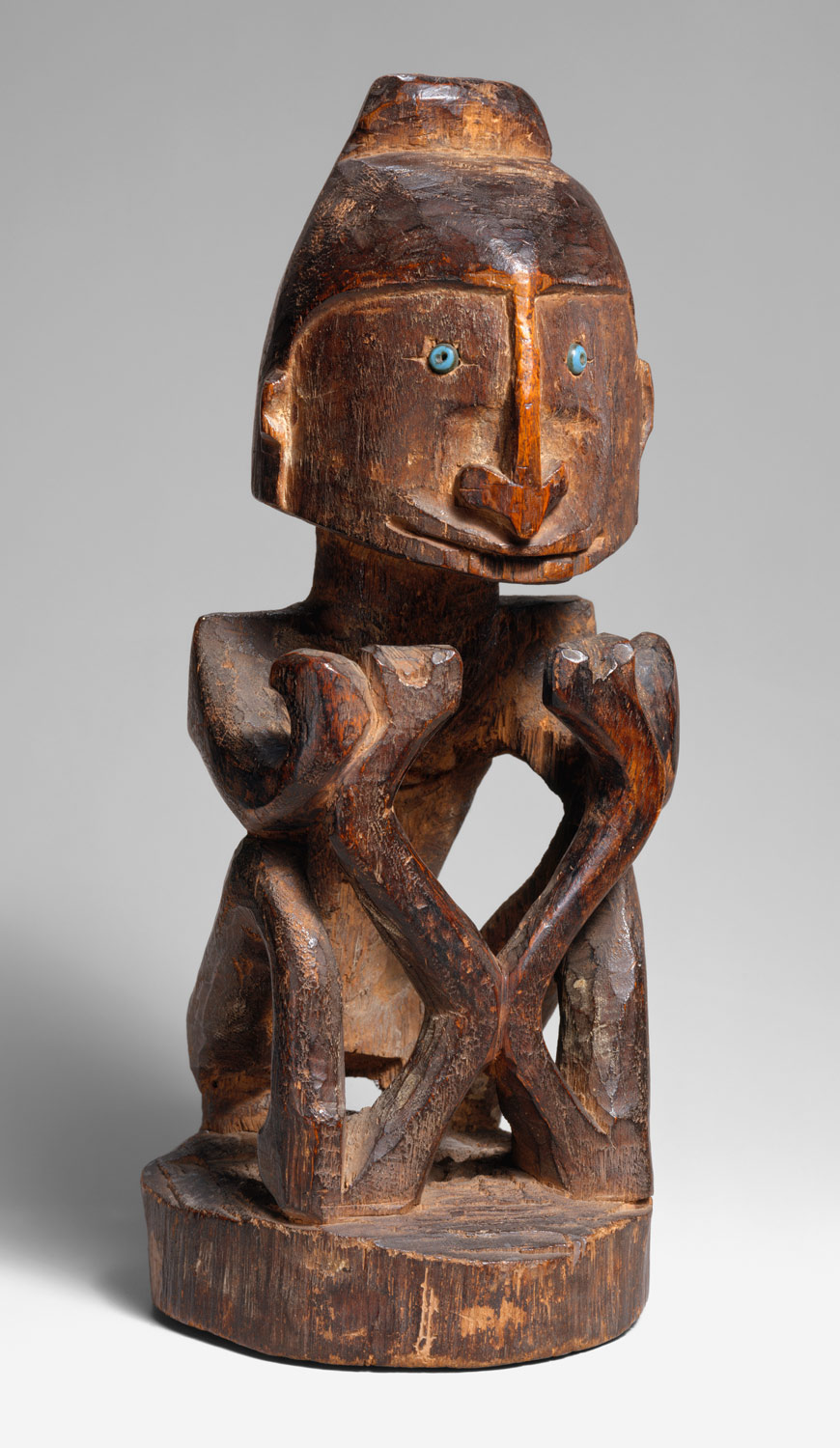
We can also speak of negative space, which refers to the area around and between the figure and ground. The illustration at right shows the negative space around the Ancestor Figure (Korwar) as shown in the photograph below. In a painting or drawing, artists often consider both positive and negative space in balancing their composition, as is discussed in the following chapter.
Form
Form is actual, three-dimensional shape, though it is often used to describe the illusion of three-dimensionality, as well. Like shape, form can be geometric or organic.
A small korwar — a representation of an ancestor — from Irian Jaya, New Guinea, mixes these form types well. While the figure is predominantly geometric, with the head shaped like a cube and the nose an arrow pointing downward, the curving organic lines around the eyes soften this effect a bit.
Color
Hue

Artists can use colors for many reasons other than to simply duplicate reality including setting moods and highlighting importance.
The colors of the world can be divided in different ways. When we use the term “color” casually, what we usually mean is hue. Hues appear on the visible spectrum. On the spectrum, we see the pure hues. These can be divided into primary, secondary and tertiary colors, as on this color wheel.
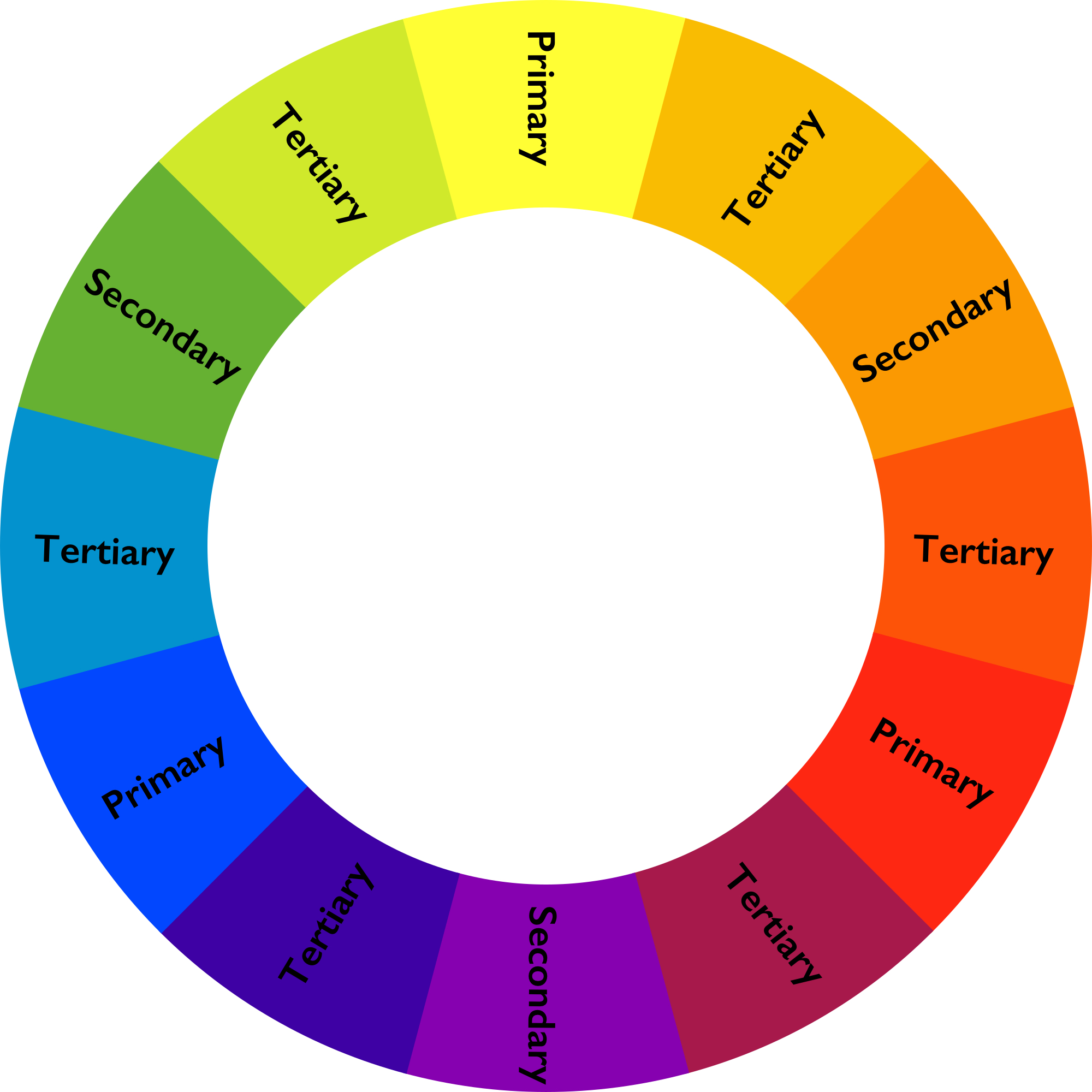
Primary, secondary and tertiary colors
Primary colors are, for most art media, red, yellow and blue (the exception is the additive color system, which is used in computer screens, theater lighting and the like, and has red, green, and blue as its primary colors). All the rest of the colors can be made from these.
Secondary colors are made by mixing two primary colors: Red and yellow make orange, and so on.
Tertiary colors are made by mixing a primary color with a secondary color.
Complementary and analogous colors
The colors opposite one another (like red and green or blue and orange) are complementary colors, which tend to stand out boldly next to one another. These are therefore often used for university colors and sport team logos. Colors next to one another (like red and orange or blue and green) are analogous colors, and these tend to blend together more smoothly.
Warm and cool colors
The colors on the left of this wheel are called cool colors and those to the right are warm colors. Using cool or warm colors in an image can create moods. Pierre Auguste Renoir used warm colors for his Mother and Child, 1886, creating a warm, cheerful, inviting scene. The oranges, pinks and yellows dominate the image.
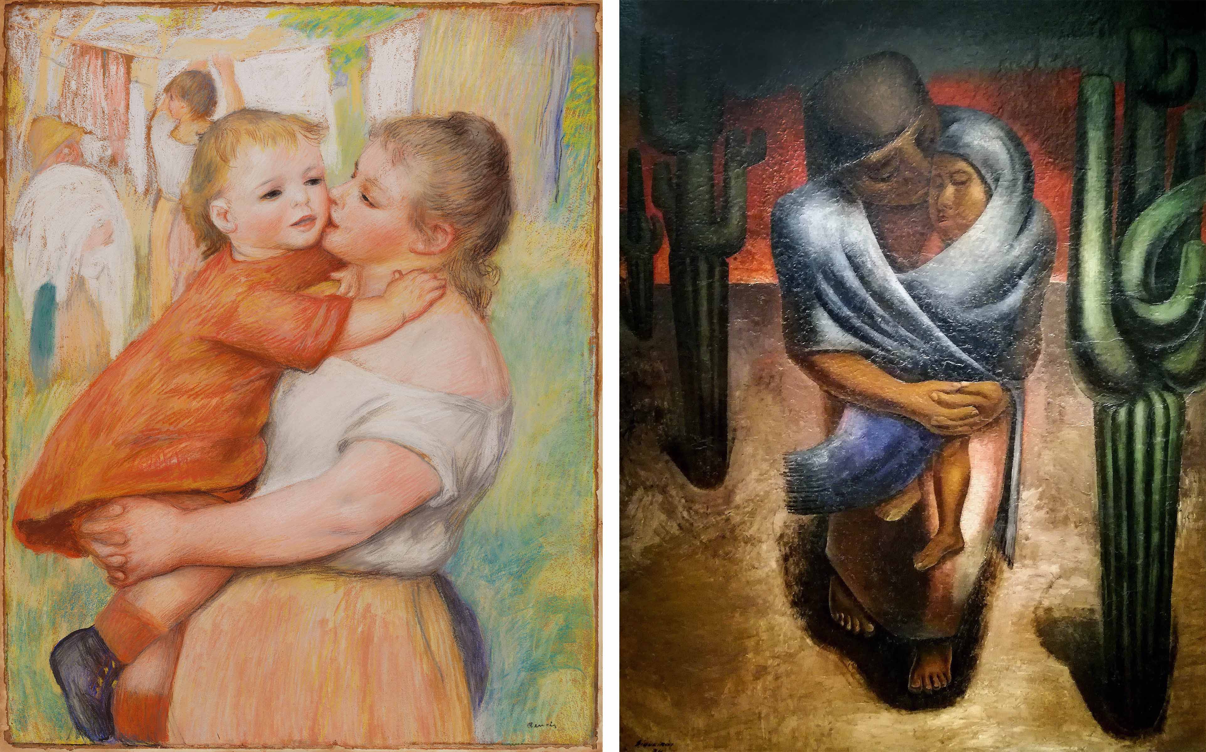
Diego Alfaro Siqueiros presents a similar subject in his Peasant Mother (1929), but through the use of cool colors, instead creates a sad, cold scene dominated by figures of blues and greens. Neither of these artists was worried about portraying the world as it really looked. Instead, they used color to inspire feelings in the viewer.
Value (tint and shade)
Color can also be considered in terms of value, which is the degree of lightness or darkness of a color. If we add white to a hue, we get a tint. If we add black, we get a shade. As we might expect, tints tend to be more cheerful — pastel colors are all tints. Shades tend to be gloomier. Indeed, our terms for moods are based on these properties, so that we say that we are lighthearted, or in a dark temper. There are many tints in the Renoir’s Mother and Child, and many shades in Siqueiros’ Peasant Mother.
Saturation
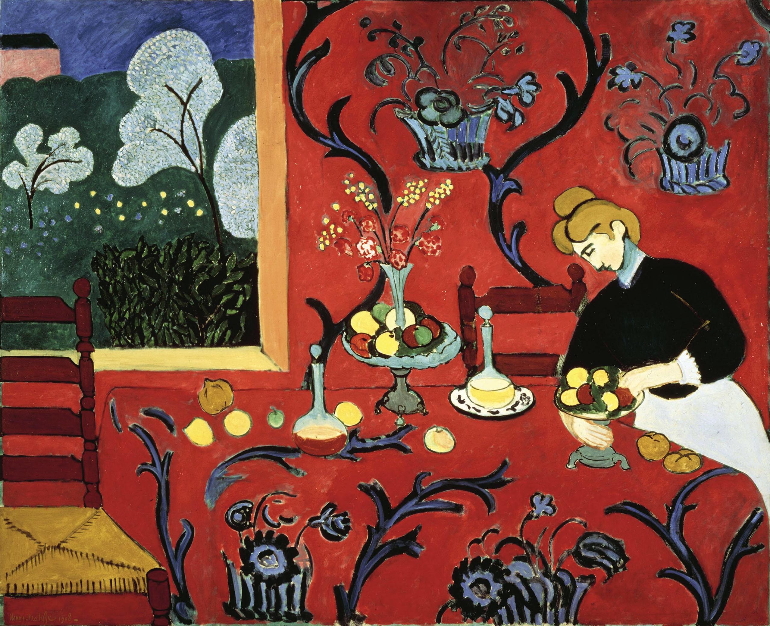
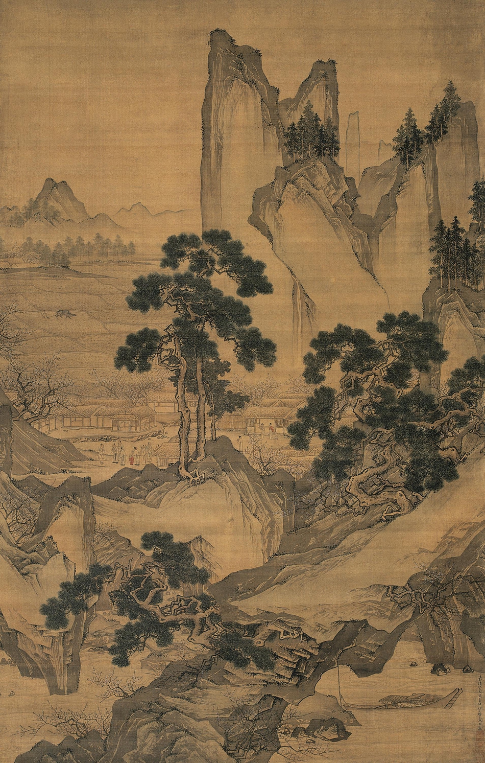
Finally, intensity or saturation is how bright or dull a color is. Henri Matisse tended to use very saturated colors, as in Red Room (Harmony in Red) (1908), whereas in Peach Blossom Spring (1533), Zhou Chen relied on a much more muted palette with very little saturation of colors.
The landscape is almost entirely in shades of brown and beige. The grey-green of the trees is low in saturation, leaving the single splash of red on the child’s clothes the only moment of high saturation in the image. Therefore, we notice this tiny detail within this large painting. The Matisse painting, on the other hand, is a blaze of colors. The vibrant red of the wall and tablecloth dominates the image, in sharp contrast with the green grass showing through the window and the blues and purples curving throughout the image.
Contrast
Contrast is the amount of variation between the highest and lowest values in a work. This is perhaps most commonly used to talk about photography, but can be applied to any work. Hiroshi Sugimoto’s Cliffs of Moher (1989) has very low contrast. There are no dark blacks, no stark whites; everything is in very similar shades of gray.
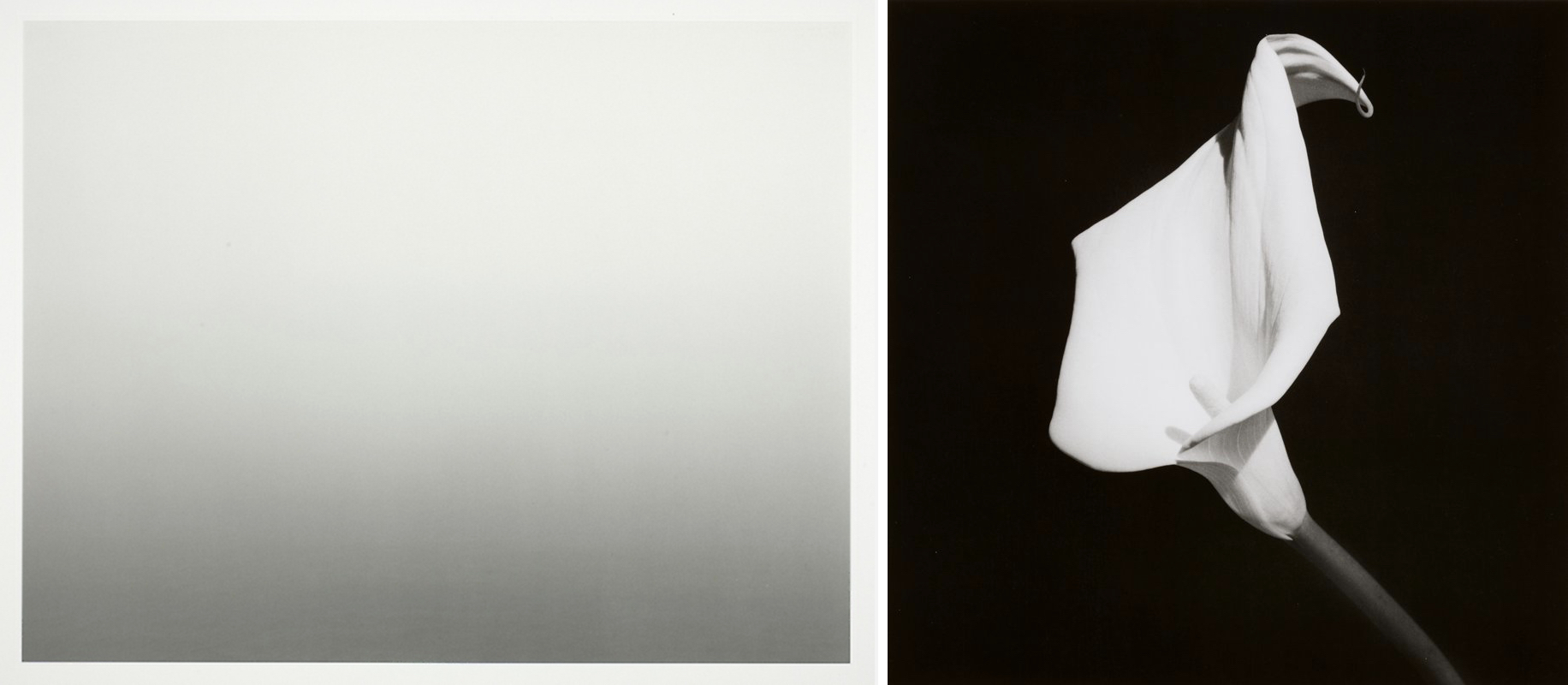
The low contrast conveys the soft and gentle feeling of a heavy mist over quiet water. On the other hand, Robert Mapplethorpe photograph, Calla Lily (1987) has much higher contrast, meaning that the difference in the whites and blacks is much greater. The effect is much sharper and crisper, making this simple flower appear grand and impressive.
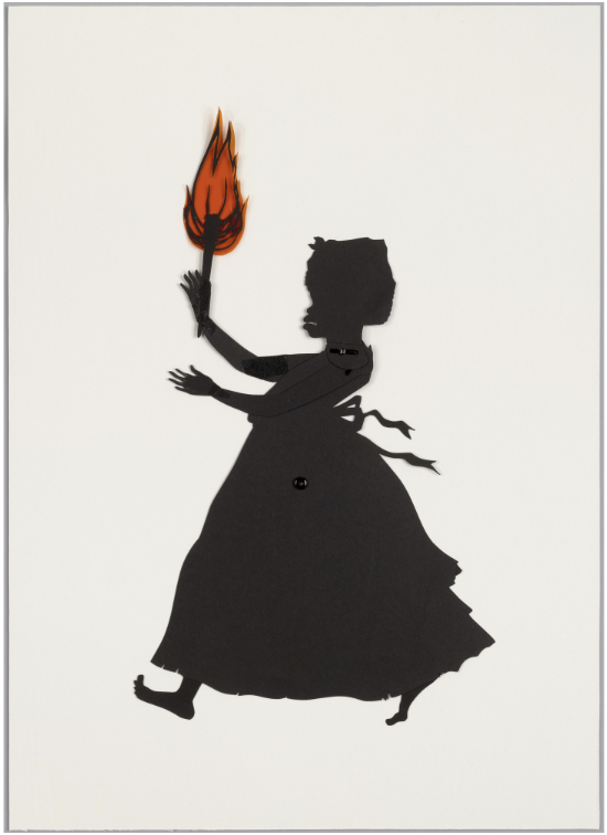
Moving yet further, in Kara Walker’s silhouette image, Untitled (from Testimony), the contrast is absolute. We see only black and white (and here, some red).
In this case, the artist is using the power of this contrast to draw the viewer’s attention to some of the problems in American race relations, and their origins in the institution of chattel slavery. Therefore, while visual elements produce visual effects, their implications can extend well beyond the purely visual.
Space
A convincing illusion of space
Space is used to refer both to depth—real or represented—and also to the general surface area within a work of art. Some periods of art history show a great deal of interest in creating convincing illusions of three-dimensional space in two-dimensional media. Perhaps the most iconic (though certainly not the only) example of this is the Italian Renaissance (c. 1400-1600), when artists very deliberately worked to created convincing illusions of depth.
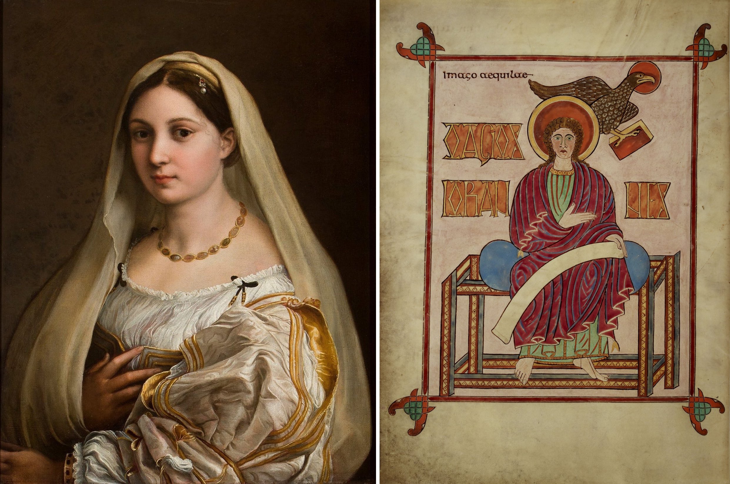
Look at how Raphael creates an illusion of three-dimensional form in La Donna Velata. Through careful variations in value, particularly in shading—the use of darker colors to create the illusion of shadows—Raphael convinces us that the woman in the painting is really there in three dimensions.
Light seems to strike her from her left, casting her right side in shadow. The folds of her voluminous sleeve are a particularly splendid example of the illusion of space. Even examining a small detail of it, it is hard to believe that there is no depth, at all, just thin layers of paint on flat canvas.
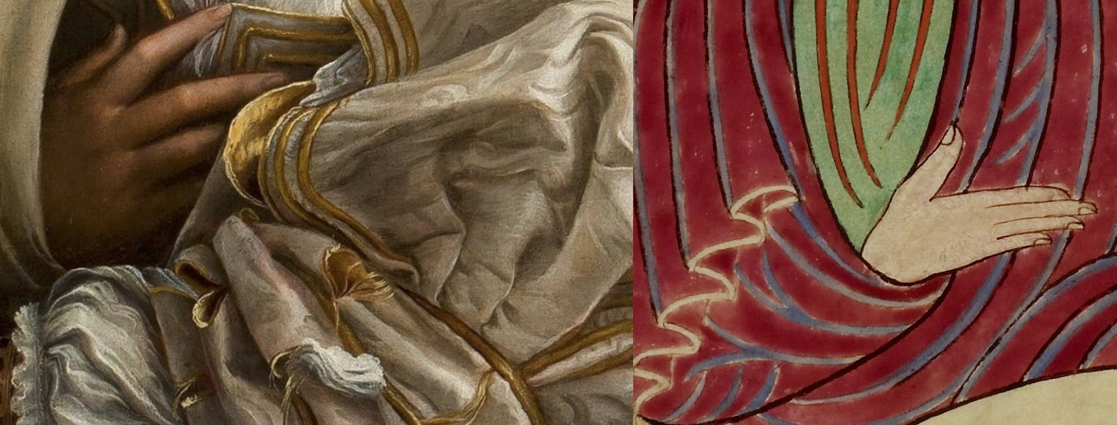
For sharp contrast, we can examine a detail of a page of the Lindisfarne Gospels. Both images show a person in voluminous robes, looking out at us, but here, the similarities end. Raphael’s figure is lit softly, creating highlights and shadows that create a sense of roundness and weight to her body and clothes. The figure of John the Evangelist from the Lindisfarne Gospels, on the other hand, is almost totally flat. There is virtually no shading to his body and the folds on his clothes are purely schematic patterns.
If we isolate a small detail of John’s sleeve, as we did with La Donna Velata’s, it is difficult to even recall that this series of lines and colors is intended to be seen as a three-dimensional form, at all.


Linear and atmospheric perspective
There are various methods used by artists to create the illusion that their figures exist in three-dimensional space. Among the more effective are linear and atmospheric perspective. Another work from the Italian Renaissance will serve to demonstrate both. Pietro Perugino’s Christ Handing the Keys to St. Peter, uses both linear and atmospheric perspective to create a very convincing illusion of depth.
Linear perspective is based on the optical illusion that parallel lines seem to converge as they recede into the distance. Railroad tracks are the classic example, as in, Wolf Vostell’s photograph from his No: Life as a Picture—A Picture as Life series from 1963. If we overlay the lines used on Perugino’s painting, we can see how he used this effect. The lines are called orthogonal lines or orthogonals and they meet on the horizon line, at the vanishing point. Note that as all the orthogonals converge, the forms also get smaller.
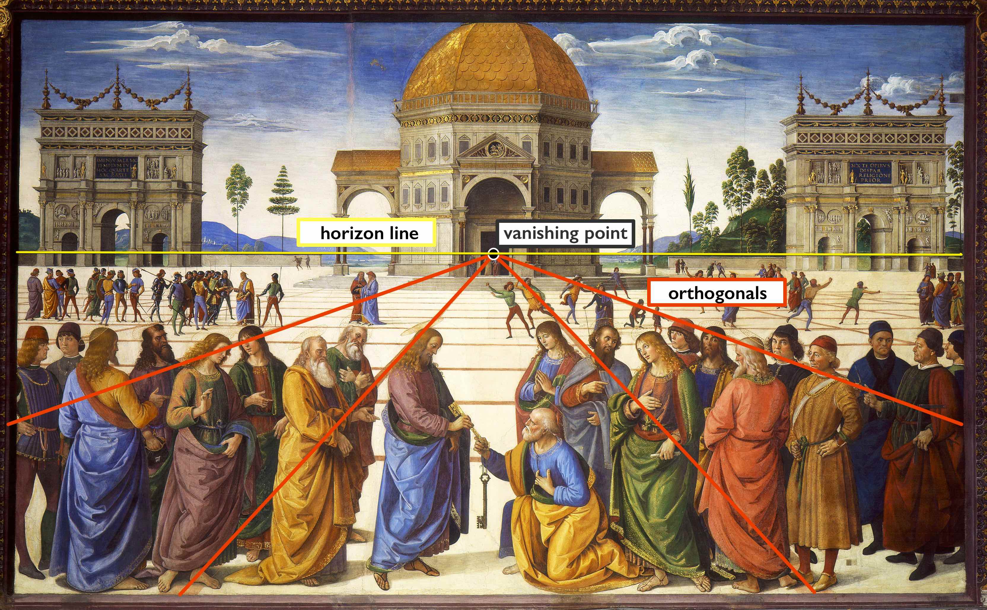
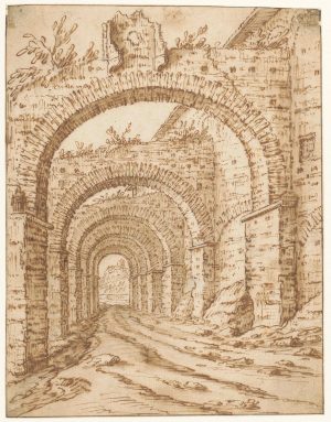
Perugino also uses Atmospheric perspective. This is based on the optical effect that makes objects in the distance appear paler, bluer, and less detailed that objects that are close to us. Returning to Perugino’s painting, we can see that he has replicated this effect, carefully making the figures in the foreground (the portion of the image that appears to be closest to the viewer) bolder in color, the smaller figures in the middle ground paler, and the hills in the background (the portion of the image that appears to be in the far distance) fading off into pale blues.The tool of one-point linear perspective is very simple, and artists can use it to create a convincing illusion of depth with only a few pencil strokes and without the careful measuring and use of a straightedge, as in Tobias Verhaecht’s sketch of a Roman ruin. Two- and three-point linear perspective are slightly more complicated, but operate on the same general principles and produce similar results.
An important note
It is important to note, though, that the use of various techniques to create a convincing illusion of depth does not make Raphael or Perugino “better” artists than the anonymous medieval monk who painted the page of the Lindisfarne Gospels, nor does it make their works any “better” or more sophisticated. The illusion of depth is one of the many tools in the artist’s toolbox, and it is serves some purposes very well, but it is not always the most powerful or effective way to convey an idea and, indeed, can sometimes be in direct conflict with the intentions of an artist.
Surface and Depth
What makes paintings feel as deep as the view from a window or as flat as a wall?
This video is part of the Art Institute of Chicago’s Art Explainer series.
Using three artworks from the Art Institute’s collection, this video unpacks a central theme and uses innovative visual storytelling to highlight the choices artists made to shape form and meaning in their works. Ultimately, it shows that each of us already possesses a powerful tool for making sense of art: looking closely. Art Explainer videos empower you to look at and understand art from any historical period or culture. Designed for students as well as adults, this video series is produced for the web and usable in a wide range of learning environments, from mobile devices to formal school classrooms.
The following works from the Art Institute of Chicago appear in this video:
Poussin, Landscape with St. John on Patmos
Harnett, For Sunday’s Dinner
Mondrian, Lozenge Composition with Yellow, Black, Blue, Red, and Gray
Texture
by DR. ASA SIMON MITTMAN
Texture is the feeling of a surface, real or represented. This might refer to the roughness or smoothness of actual objects and art media, or to the illusion of these properties.
Surface texture
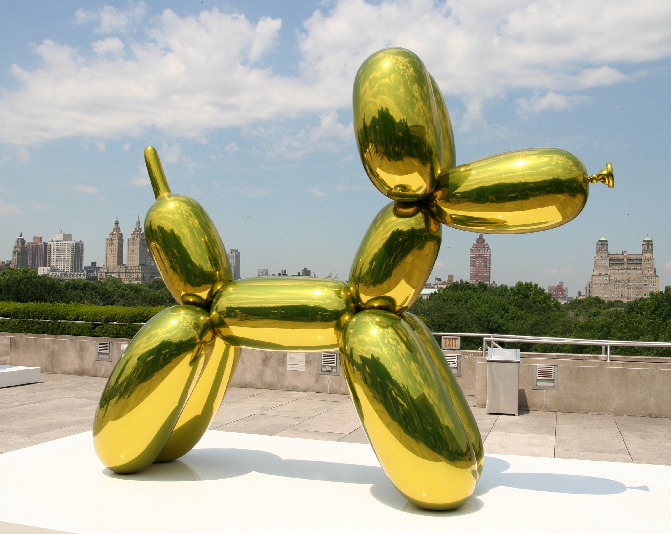
Jeff Koons’ Balloon Dog has a perfectly smooth, mirrored surface it is difficult to resist touching (though we must). It is this surface texture that turns these replicas of commonplace, short-lived and disposable items (balloon animals) into precious objects.
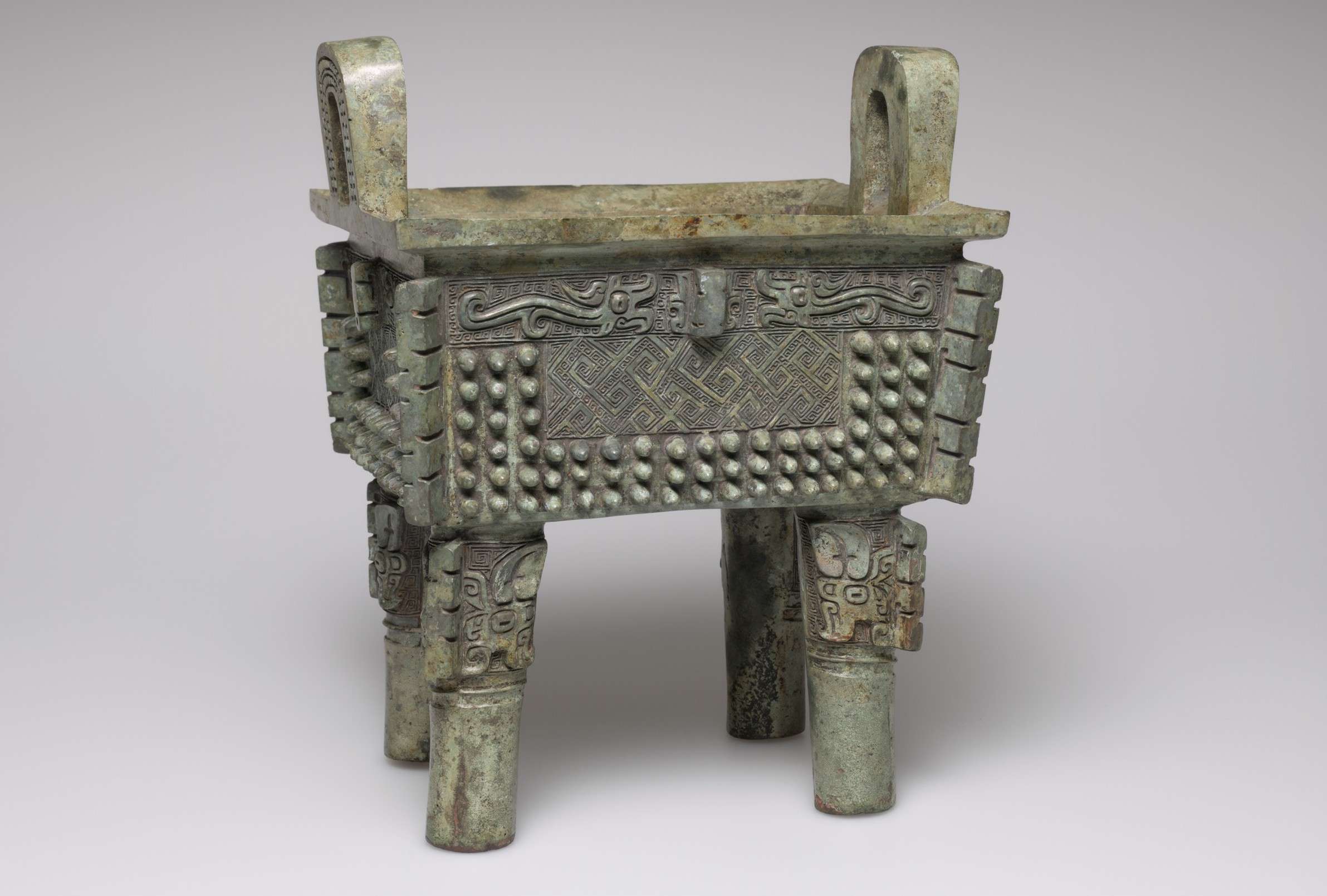
In contrast, the coarse, bristly surface of an ancient Shang Dynasty Fang-Ding—a ritual vessel used in worshipping dead ancestors—grants the work a vibrant energy, but does not invite our touch.
The illusion of texture
The illusion of texture is no less important to our experience of works of art.
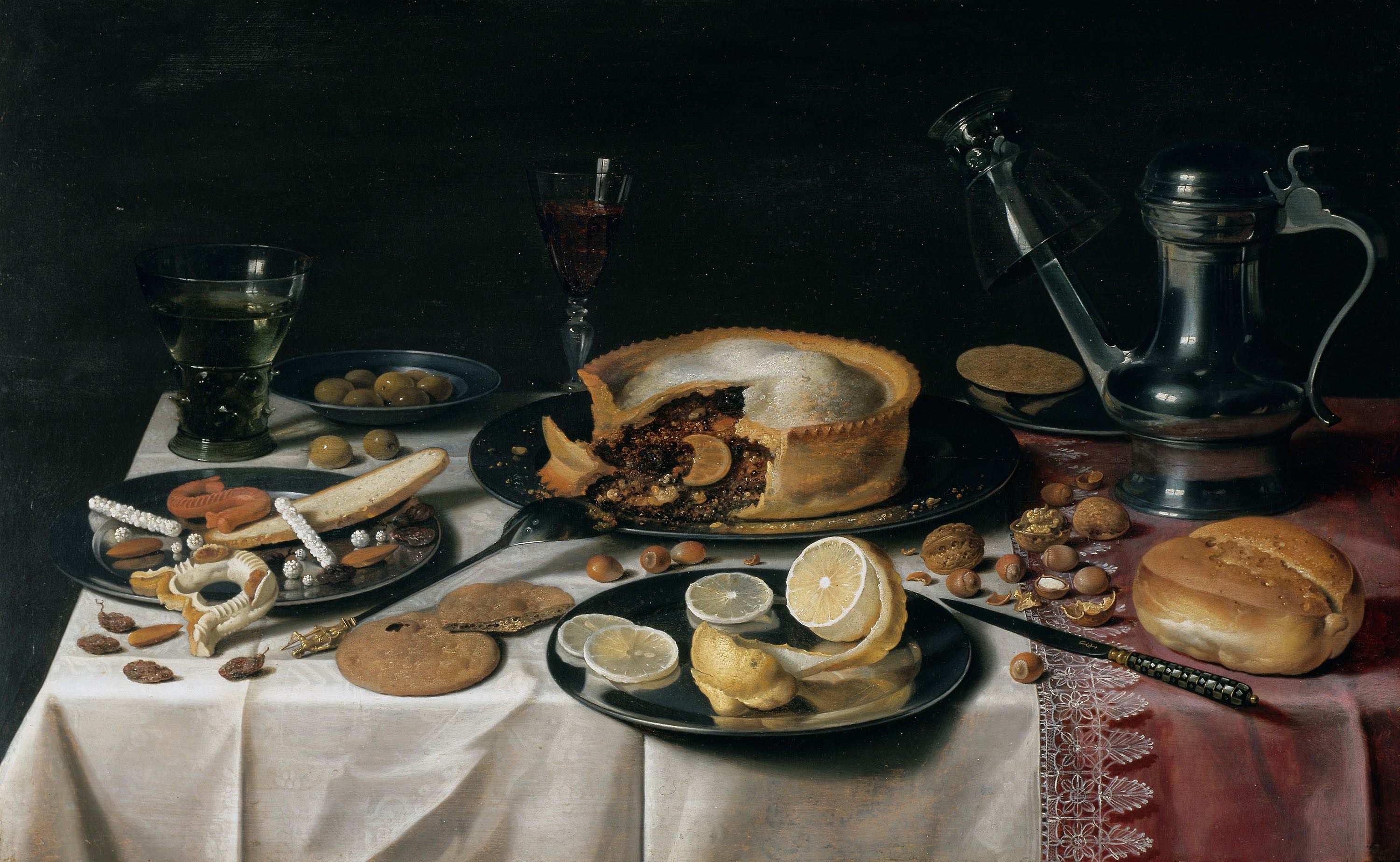
Dutch still life paintings are justly famous for their careful, illusionistic replication of objects. The smooth silver plates and glass goblet of Pieter Claesz’s Still Life seem to tease us, as do the rougher cookies and breads, and the crumbly pie. The knife handle, pointing out of the image toward us, seems just beyond our grasp, and therefore makes this magnificent spread all the more tantalizing.
Light and Shadow
How does an artist use light to help keep us out of the dark? Using three artworks from the Art Institute’s collection, this video unpacks a central theme and uses innovative visual storytelling to highlight the choices artists made to create light and shadow in their works. Art Explainer videos empower you to look at and understand art from any historical period or culture. Designed for students as well as adults, this video series is produced for the web and usable in a wide range of learning environments, from mobile devices to formal school classrooms.
The following works from the Art Institute of Chicago appear in this video:
Tanner, The Two Disciples at the Tomb
Kollwitz, Battlefield
Flavin, “monument” for V. Tatlin
Articles in this chapter:
- Dr. Asa Simon Mittman, “Line,” in Smarthistory, June 23, 2019
- Dr. Asa Simon Mittman, “Shape and Form,” in Smarthistory, July 11, 2019
- Dr. Asa Simon Mittman, “Color,” in Smarthistory, June 24, 2019
- Dr. Asa Simon Mittman, “Space,” in Smarthistory, July 9, 2019
- Dr. Asa Simon Mittman, “Texture,” in Smarthistory, July 10, 2019
- Art Institute of Chicago, “Surface and Depth,” in Smarthistory, January 26, 2018
- Art Institute of Chicago, “Light and shadow,” in Smarthistory, February 7, 2018
the characteristics of a work of art that can be recognized by the eye--line, shape, color, space, texture, etc. These are separate from an artwork's content or story.
what a work of art is about; its story
representational art depicts recognizable objects or scenes
not depicting recognizable objects. Non-representational art is sometimes described as pure abstraction.
a style of representation that veers from naturalism, often flattening recognizable natural forms into shapes which may or may not be recognizably figurative
a style of representation that perfects or makes "ideal" the subject's features, proportions, etc., in accordance with prevailing beauty standards
an artistic approach that conforms to particular conventions, or systems, rather than faithfully representing the natural world
the organization of elements within a work of art
lines that define the borders of a shape
a heavy, often black, contour line
closely-spaced parallel lines
in art, defining lines or shapes that are loose and curving like those found in nature
lines that are not actually drawn, but that allow us to "connect the dots" to create the lines in our minds
the property of a two-dimensional form, usually defined by a line around it or a change in color
the area around and between the figure and ground
actual, three-dimensional shape (or the illusion of three-dimensionality)
the colors red, yellow, and blue, from which the rest of the colors can be formed
colors formed by mixing two primary colors
colors formed by mixing a primary color with a secondary color
colors across the color wheel from each other and that both appear more bold when placed next to each other
colors next to one another on the color wheel, which tend to blend together smoothly
the degree of lightness or darkness of a color
how bright or dull a color is; also referred to as intensity
the amount of variation between the highest and lowest values in a work
the use of darker colors to create the illusion of shadows
a system for depicting space that is based on the optical illusion that parallel lines seem to converge as they recede into the distance
the lines used in the technique of linear perspective that converge at the vanishing point to suggest the illusion of depth
in linear perspective, the point at which the orthogonals converge
the real or simulated surface quality (roughness or smoothness) of an object
